
Programming Standards - Selection Criteria
Field Representation
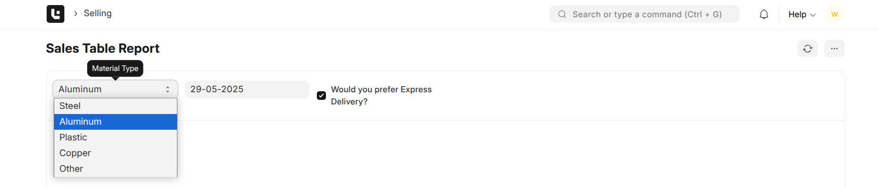
Use Case: A sales engineer is trying to find a specific quotation using the Sales Table Report, by specifying values like Material Type, Quotation Date, and Express Delivery.
Standards:
-
Every field must have a clear and descriptive label.
This ensures that users immediately understand what information is required. -
Internationalization support via
__().
Use the translation function for all labels and descriptions to support users in their preferred language (if preferred). -
Tooltips or descriptions are mandatory.
Provide concise guidance to help users enter the correct information, reducing confusion.
❌ Incorrect Way
filters: [ { fieldname: "material", fieldtype: "Select", label: "", // No label — the user won’t know what this field is for // Missing description — no guidance on what this field does // Options were not provided for Select datatype }, { fieldname: "delivary_date", // Typo: should be "delivery_date" fieldtype: "Date", label: "Delivery Date", // Missing description — no guidance on what this field does }, { fieldname: "express_delivery", fieldtype: "Check", label: "Express Delivery", // Not phrased as a question and not translated description: "Tick if you want your order to be processed with express delivery." }]✅ Correct Way
filters: [ { fieldname: "material_type", fieldtype: "Select", label: "Material Type", // Clearly indicates the purpose of this field description: "Select the base material for the product" // Provides a tooltip to help the user understand the field's purpose options: ["Steel", "Aluminum", "Plastic", "Copper", "Other"] // Always provide options for Select fields so users can only choose valid, available values }, { fieldname: "delivery_date", fieldtype: "Date", label: "Requested Delivery Date", // Clearly indicates which date is needed description: "The date the customer expects delivery" // Clarifies what the user should input here }, { fieldname: "express_delivery", fieldtype: "Check", label: __("Would you prefer Express Delivery?"), // Question-style label is best for checkboxes, as it prompts a clear yes/no response and is translated to the customer's language description: __("Select the base material for the product") // Explains what checking the box means }]Output:
| Field UI | Label Shown | Tooltip (on hover or below) |
|---|---|---|
| Dropdown | Material Type | Select the base material for the product |
| Calendar | Requested Delivery Date | The date the customer expects delivery |
| Checkbox | Möchten Sie eine Expresslieferung? | Auswählen, wenn Expressbearbeitung erforderlic ist. |
Field Type Appropriateness
Date Field
Usecase:
The sales engineer wants to filter quotations by the date they were created.
Standard:
-
Use
Datefieldtype This ensures the field only accepts valid date values and provides a user-friendly calendar picker, improving data quality and user experience. -
Set default to
Today()or meaningful predefined dates. Helps users by pre-filling the field with a sensible value for reducing effort.
❌ Incorrect Way
{ fieldname: "quotation_date", fieldtype: "Data", // Wrong: 'Data' allows any text, so users can enter invalid date formats (e.g., "tomorrow", "12/34/5678", or even "hello"). label: "Quotation Date" // Wrong: No calendar picker is provided, so user experience is poor and data may be inconsistent format.}✅ Correct Way
{ fieldname: "quotation_date", fieldtype: "Date", // Right: 'Date' enforces valid date input and provides a calendar picker for the user. label: "Quotation Date", default: Today() // Right: Sets the default value to today's date for user convenience. description: "Select the date this quotation was created"}Output: Users see a date field where they can only pick a valid date from a calendar and the field is pre-filled with today’s date.
Select Field
Usecase:
The sales engineer needs to filter by the status of a quotation (e.g., Open, Closed).
Standard:
-
Use the
Selectfieldtype.
Only allows selection from predefined options. -
Always define an explicit options list.
Restricts input to valid business values. -
Set a default value.
Ensures the field is never empty. -
If options are dynamic, use
get_queryor custom JavaScript.
Updates the options list based on context.
❌ Incorrect Way
{ fieldname: "status", fieldtype: "Data", // Wrong: 'Data' allows any text, so users can enter invalid or inconsistent statuses (e.g., "open", "OPENED", "done", "pending", etc.). label: "Status" // Wrong: No options are provided, so there is no restriction on what users can enter. // Wrong: No default value}✅ Correct Way
{ fieldname: "status", fieldtype: "Select", // Right: 'Select' restricts input to predefined options. label: "Status", default: "Open", // Right: Defaults to "Open". options: ["Open", "Closed", "Pending"], // Right: Only valid statuses can be selected, ensuring consistent reporting and filtering. description: "Select the current status of the quotation"}Output: Users see a dropdown menu where they can only select a valid status from the predefined list.
Link Field
Usecase:
The sales engineer wants to filter quotations by customer.
Standard:
-
Use the
Linkfieldtype.
This ensures users can only select from existing records in another DocType, maintaining referential integrity. -
Set the
optionsproperty to the target DocType.
This restricts the field to valid references (e.g., only existing customers).
❌ Incorrect Way
{ fieldname: "customer", fieldtype: "Data", // Wrong: 'Data' allows any text, so users can enter non-existent or misspelled customer names. label: "Customer" // Wrong: No link to existing records, so there is no validation or search functionality.}✅ Correct Way
{ fieldname: "customer", fieldtype: "Link", // Right: 'Link' ensures only valid records from another DocType can be selected. label: "Customer", options: "Customer", // Right: Restricts selection to existing customers only. description: "Select the customer for this quotation" // Optionally, add a get_query function to filter the customer list based on context.}Output: Users see a searchable dropdown where they can only select an existing customer from the list.
Data Field
Usecase:
The sales engineer wants to filter quotations by a custom reference code that can be any text or alphanumeric value.
Standard:
-
Use the
Datafieldtype.
This allows users to enter short, free-form text or alphanumeric values. -
Do not use
Datafor structured data types.
Avoid usingDatafor dates, numbers, select options, or links to other DocTypes—use the appropriate fieldtype instead.
❌ Incorrect Way
{ fieldname: "reference_code", fieldtype: "Select", // Wrong: 'Select' restricts input to predefined options, which is not suitable for free-form codes. label: "Reference Code"}✅ Correct Way
{ fieldname: "reference_code", fieldtype: "Data", // Right: 'Data' allows for any short text or alphanumeric input, suitable for custom codes. label: "Reference Code", description: "Enter the custom reference code for the quotation"}Output:
Users see a text input where they can enter any alphanumeric reference code.
Check Field
Usecase:
The sales engineer wants to filter quotations that require express delivery (Yes/No).
Standard:
-
Use the
Checkfieldtype.
This provides a checkbox for boolean values, allowing users to indicate yes/no or true/false choices clearly. -
Do not use
Checkfor non-boolean data.
Only use for binary options—never for text, numbers, or multiple choices. -
Label should be phrased as a question.
This makes it clear to the user what checking the box means (e.g., “Would you like to have express delivery?”).
❌ Incorrect Way
{ fieldname: "express_delivery", fieldtype: "Data", // Wrong: 'Data' allows any text, so users could enter "yes", "no" or anything else, which will not be considered a boolean value. label: "Express Delivery" // Wrong: The label is not phrased as a question, so the intent is unclear.}✅ Correct Way
{ fieldname: "express_delivery", fieldtype: "Check", // Right: 'Check' provides a checkbox for a clear yes/no choice. label: "Would you like to have express delivery?", // Right: Question-style label clarifies the user's choice. description: "Tick if express delivery is required for this quotation"}Output:
Users see a checkbox with a clear, question-style label.
MultiSelect Field
Usecase:
The sales engineer wants to filter quotations by multiple tags (e.g., Priority, VIP, Repeat Customer, International).
Standard:
-
Use the
MultiSelectfieldtype.
This allows users to select multiple values from a predefined list, supporting flexible filtering and categorization. -
Always define an explicit options list.
Restricts input to valid tags. -
Set a default value if appropriate.
Ensures the field is not empty if required. -
Do not use
MultiSelectfor single-choice data.
Use only when multiple selections are needed; otherwise, useSelect.
❌ Incorrect Way
{ fieldname: "tags", fieldtype: "Data", // Wrong: 'Data' allows any text, so users could enter anything leading to inconsistent. label: "Tags" // Wrong: No options are provided, so there is no restriction or guidance for users.}✅ Correct Way
{ fieldname: "tags", fieldtype: "MultiSelect", // Right: 'MultiSelect' allows users to select multiple tags from a predefined list. label: "Tags", options: ["Priority", "VIP", "Repeat Customer", "International"], // Right: Only valid tags can be selected, default: ["Priority"], // Right: Defaults to "Priority" selected.ensuring consistent categorization and filtering. description: "Select one or more tags for this quotation"}Output:
Users see a multi-select dropdown with valid tags, defaulting to “Priority”.
Text Field
Usecase:
The sales engineer wants to add remarks or comments to a quotation, which may require multi-line or lengthy input.
Standard:
-
Use the
TextorSmall Textfieldtype.
Allows longer, multi-line, or unstructured text. -
Do not use
Datafor long or multi-line text.
Datais for short, single-line input only.
❌ Incorrect Way
{ fieldname: "remarks", fieldtype: "Data", // Wrong: Not suitable for lengthy or multi-line comments. label: "Remarks" // Wrong: Users may run out of space or be unable to format their input properly.}✅ Correct Way
{ fieldname: "remarks", fieldtype: "Text", // Right: 'Text' allows for multi-line, lengthy, and unstructured input, suitable for comments or remarks. label: "Remarks", description: "Enter any additional comments or notes for this quotation"}Output:
Users see a multi-line text box for detailed remarks or comments.
Mandates & Defaults
Use Case:
A sales engineer must always specify the “Region” for a quotation, and it should default to “North” if not selected.
Standard:
-
Mandatory fields must be explicitly marked.
The field cannot be left blank and is clearly indicated as required (usually with a red asterisk or similar UI marker). -
Mandatory fields must have default values.
This prevents form submission failures and reduces the chance of accidental omissions.
❌ Incorrect Way
{ fieldname: "region", fieldtype: "Select", label: "Region" // Wrong: The field is not marked as mandatory, so users can leave it blank. // Wrong: No default value is set, so the field could be empty even if it is later made mandatory.}✅ Correct Way
{ fieldname: "region", fieldtype: "Select", label: "Region", // The UI will indicate this field is required by providing a red asterik. options: ["North", "South", "East", "West"], reqd: 1, // Right: Explicitly marks the field as mandatory. default: "North" // Right: Sets a default value ensuring the field is never empty.}Output:
Users see a “Region” field that is clearly marked as mandatory (typically with an asterisk or highlight). “North” is pre-selected as the default value.
Dynamic & Conditional Behavior
Use Case:
A sales engineer filters quotations by “Customer.” The customer list should only show active customers, and the “Region” filter should appear only if a customer is selected.
Standard:
-
Avoid excessive filters
Only show filters that are relevant to the user’s context to reduce clutter. -
Use
get_queryfor dynamic data
Dynamically fetch dropdown values, e.g., only show active customers. -
Use
depends_onfor conditional visibility
Show or hide fields based on the user’s selection (e.g., show “Region” only if a customer is selected).
❌ Incorrect Way
{ fieldname: "customer", fieldtype: "Link", label: "Customer", options: "Customer" // Wrong: Shows all customers, including inactive ones. // Wrong: "Region" filter is always visible, even if no customer is selected.}✅ Correct Way
{ fieldname: "customer", fieldtype: "Link", label: "Customer", options: "Customer", get_query: function() { return { filters: { status: "Active" // Only show active customers } }; }},{ fieldname: "region", fieldtype: "Select", label: "Region", options: ["North", "South", "East", "West"], depends_on: "eval:doc.customer" // Show "Region" only if a customer is selected}Output:
Users see only active customers in the dropdown. The “Region” filter appears only after a customer is selected.
Validation
Use Case:
A sales engineer must select a date range for filtering quotations. The “From Date” should not be after the “To Date”.
Standard:
-
Validate filter inputs.
Ensure user inputs are logical and follow business rules. -
Use
frappe.throwfor filter validation.
Immediately alert users to incorrect input and prevent further action.
❌ Incorrect Way
frappe.ui.form.on('Quotation', { refresh: function(frm) { frm.fields_dict.from_date.$input.on('change', function() { // Wrong: No validation, so users can select an invalid date range. }); }});✅ Correct Way
frappe.ui.form.on('Quotation', { refresh: function(frm) { frm.fields_dict.to_date.$input.on('change', function() { if (frm.doc.from_date && frm.doc.to_date && frm.doc.from_date > frm.doc.to_date) { frappe.throw("From Date cannot be after To Date."); frm.set_value('to_date', ''); } }); }});Output:
If a user selects a “From Date” that is after the “To Date,” an error message appears and the invalid input is cleared, ensuring only valid date ranges are used for filtering.
User Experience
Use Case:
When a sales engineer selects “Express Delivery,” the system should automatically set the “Priority” field to “High.”
Standard:
- Comment custom logic inline.
Always add clear comments explaining any custom or non-obvious logic in your code. This improves maintainability and helps other developers understand your intent.
❌ Incorrect Way
frappe.ui.form.on('Quotation', { express_delivery: function(frm) { if (frm.doc.express_delivery) { frm.set_value('priority', 'High'); // No comment explaining why this is set } }});✅ Correct Way
frappe.ui.form.on('Quotation', { express_delivery: function(frm) { // Check if the Express Delivery checkbox is selected if (frm.doc.express_delivery) { // If express delivery is selected, automatically set priority to 'High' // This ensures urgent orders are flagged for faster processing in downstream workflows frm.set_value('priority', 'High'); } else { // If express delivery is not selected, reset priority to default (if needed) // This prevents non-express orders from being incorrectly marked as high priority frm.set_value('priority', 'Normal'); } }});Output:
Other developers can quickly understand why the “Priority” is set to “High” when “Express Delivery” is selected.